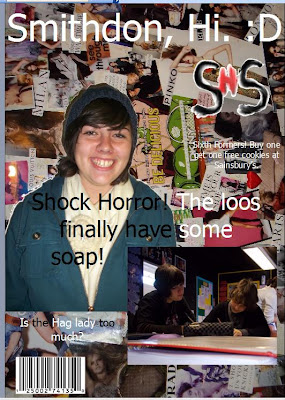
This actually is my final front cover now.
I took away the image of the school as I wanted my front cover to feature a mid-shot of a student.
I took this picture myself on my own camera and uploaded it onto the computer.
I then opened it into Photoshop and cut out the image. I also airbrushed the image to get rid of any blemishes or imperfections, and also gave it a more even looking skin tone. This way the picture looks more professional and is a more typical image that you would find on the front of a magazine.
Because of the new photo I chose to use as my main image, I had to change the colour of the font overlapping it as the main headline 'Shock Horror! The loos finally have some soap!' because white was difficult to see over the image.
Everything else is the same.
2 Good Points: I like the background of your magazine
ReplyDeleteThe pictures relate well to school/college.
2 Bad Points: The font and colour of text could be edited as some is hard to read
You could move or resize hte image so there is less blank space.