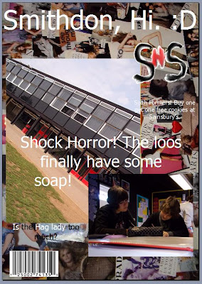
This is my final Front Cover for my preliminary task. I have added my main image which is a photograph I took myself of the school from the field perspective.
I tried many different distances and angles whilst taking a picture of the school to see which one looked the best, as well as being eye catching and different. I didn't just want a dull, standard straight image of the school that wouldn't stand out.
I liked this image as it was at an interesting angle which draws you in. It is also, I think, a good picture of the school building. It also captures a small section of the grass.
The image was initially bigger, but I cropped it slightly so it would fit in better. Also, it looks better this way as I only cropped out the edge of the building and a bit of the grass.
I think the image contrasts well with not only the background image and the smaller image, but the text aswell. It doesn't blend the text in and the colours don't clash.
I have, like many popular magazines, stuck to a simple colour scheme. My main colours are black, red and white. These colours go quite well together and do not clash, but are also quite bold. Red is a 'stop' colour and I think the whites and blacks help bring it out more. I also think these are relatively sophisticated colours and aren't too 'in your face'. Also, they are similar to the school colour scheme, which was an added bonus.
I will put my different distances and angle images in a seperate blog explaining why I did each one and my explanation on why I chose not to use those images.
In my main task I will use Photoshop and/or GIMP 2 as this will enable me to manipulate the images on the front cover. This way it will look more professional and I can use more effects etc.
Well done for completing your preliminary task. Mention how you plan to use Photoshop with your main task as this will enable you to manipulate the images on the front cover. I would also recommend print preview your front cover then screen shot. This will enable you to see the finished print product as opposed to the layout design. Miss Brown.
ReplyDeleteThis comment has been removed by the author.
ReplyDeleteDone. :D
ReplyDeleteI have changed the image and added about Photoshop at the bottom.