For my research I am looking at what techniques and methods different magazines use to grab readers attention.
For this particular part of my research, I am using the popular magazines 'More', 'Kerrang' and 'Company'. They are 3 quite different magazines, 'More' is very gossip and celebrity based, where 'Company' has the odd interview, and the rest is mainly stories or advice collumns on things such as sex and health, etc. Kerrang is completely different, as it is a music magazines concentrating on advertising gigs, tours and promotions, whilst featuring some interviews along with posters inside. Although they are all quite different, they all use similar techniques in catching us as an audience's attention.
They all have one big main image on the front cover advertising the main story being featured within the magazine, with a white background, and a small piece of text hinting what the main feature is about. They also all have a large, eye-catching masthead at the top of the page, which in all 3 magazine's cases, the main image slightly overlaps the text of the masthead.
Another similarity I have noticed is that they all stick to a 3 colour colour-scheme. 'More' uses mainly black, yellow and pink. 'Kerrang' uses mainly black, yellow and red. 'Company' uses mainly black, white and pink. So not only have they all used a 3 main colour colour-scheme, they have used relatively the same colours. Black, red and yellow are all very 'alertive', eye-catching colours which make you stop and notice. Red is also a very good colour to use as it is usually associated with 'stop' or a 'warning' colour, instantly grabbing people's attention.
Both 'More' and 'Kerrang' have smaller images and other features within the magazine around the main image, though it does not look crowded. They both also have snippets of text around the main image detailing other features of the magazine such as quotes from interviews or advertisements.
'Company' on the otherhand, doesn't display any other images on the front apart from the main image. Although, it does have a lot more text than the other two. It displays many features of the magazine, quoting stories and advertisements, but it does not look too busy. I think the reason why 'Company' has more text on the front than the other two is because it is not only a thicker magazine with more pages, but it is also a much more text based magazine with more stories and advice collumns.
Typically of all magazines, they all present us with the date, price and a barcode. The date and price are usually hidden away somewhere near the top, so it doesn't take up too much space but it is still visible to the reader. The barcode is usually somewhere near the bottom, out of the way of the main feature.
To conclude, most magazines are generally similar in their efforts to attract us to their product. Main image, basic 3-4 bold colour-schemes and catchy features.
Using this, when planning my Preliminary and Main Task I will have to consider all of these popular techniques as well as the media codes and conventions, which are split into 3 main groups:
- Technical (camera techniques and shots, ie distance/angle of shot.)
- Symbolic (clothing, colours. Has to be appropriate to the features of the magazine.)
- Written and Audio (music etc.)
In order to recieve a positive response from the viewers and for my projects to be an overall success, I need to pay attention to these codes and conventions, as they determine the reaction my products will get.
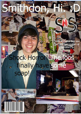
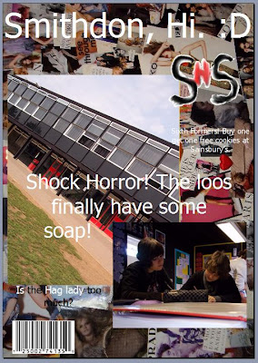
I have made my Mock Ups on Microsoft Publisher, but my final piece will be created/edited in either Photoshop or GIMP 2, or any other useful Image Manipulating Programme.


