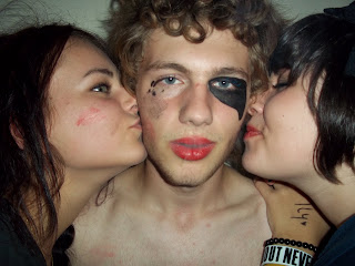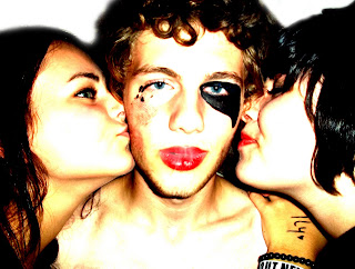

Here is my original photo that I took using my own camera, along with the final edit.
After uploading my images onto my computer into Picasa 3, I edited quite a few, but ensured that I still had the originals saved so I could refer back to them.
This was my first edit of the image. I turned up the brightness and the ‘shadows’ bar featured in Picasa 3 which changed the contrast making the colours bolder and warmer.
I also slightly retouched this image, getting rid of Zofia’s (girl on the left) moles on her chin and some of Victoria’s (girl on right) face moles/blemishes. There was also a scar on David’s (man in the middle) nose that I have retouched out because it looked quite red.
I then went on to upload them onto the school computer and opened them up in Photoshop. Obviously there were far more tools in Photoshop compared to my basic image manipulating programme Picasa 3. I used the 'Spot Healing Brush' to take away some blemishes and uneven skin tone on their faces, and found it was far more affective and professional looking than my 'retouch' tool on Picasa 3, so from then on I did all editing like that on Photoshop.
Although I found Photoshop better on this level, I prefer editing the brightness and constrast on Picasa 3 as - to me - it looks more professional and I get more vivid, better looking colours. I also found sometimes when I upped the brightness on images in Photoshop they sometimes looked distorted and pixelated, to which I did not get this with Picasa 3, they had a nicer finish.
I have also taken the background out, as I was originally using the photo as my front cover image, and the background of my front cover is white, so it looked odd with a green background on the photo. I did this by simply colouring in the background in white using the paint brush tool on photoshop. I used a light brush so to speak, which gave it a nice blurred effect around the edges of the people, which I quite liked. I did try other methods to get rid of the background, like rubbing out the background using the eraser tool or cutting it out, but I always ended up with a rough looking edge, and found this easy method to look better in my opinion. Also, I found some other methods of eliminating the background quite stressful.

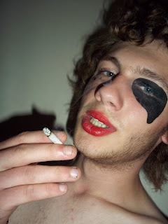
I then went on to use this photo as my main cover image, because it was easier to place as it is landscape. Also, it portrays my 'Generation Y' criteria well as he is smoking.
Again, I did the brightness and contrast editing in Picasa 3 for the same reasons as before. I then edited out all blemishes in Photoshop. It made his lips really stand out, which is good as it is in the middle sector of the 'rule of thirds' so you are attracted to it right away. I also really like the tone of the skin after adjusting the brightness - I think they are nice, warm colours.
I spent a lot of time editing out blemishes on this photo. David had quite a few marks on his chest - some were blemishes, where some were lipstick marks - so I had to be careful as to which marks I erased out.
Although I didn't want David to be covered in blemishes, I didn't want him to look 'too perfect' as he is meant to be quite rouge, rugged and 'real' - you get too many airbrushed, fake-looking people on the front of magazines nowadays - which too me makes me want to buy it less.
I again edited out the background as my front cover background is going to be white. I used the same method on this image as I did on my previous image. The only trouble with this is it meant I lost some of the smoke coming from his cigarette which you could see in the background, but you can still see some on his face, which I like. I also got rid of the shadows, because it looked better without them.
Not only did I decide to use this image because it was landscape - it fits perfectly to A4 size, so it basically is my background - but it was also the favourite in my questionairre which, yet again, I am in the process of uploading along with my questionairre itself. Not only that, I personally like this photo - it's eye catching and it is advertising the main person being featured, and I have plenty other edited images for my double page spread which were all edited in the same way to these pictures.
P.S. Sorry about the terrible layout, me and Blogger don't get along.

No comments:
Post a Comment