
Monday, 6 December 2010


Some Image Edits~
Here are some images that I edited in both Picasa 3 and Photoshop using the same methods as edited images I have previously blogged.


There are many images that I did not use in my final piece for varied reasons: either they were the wrong layout, didn't fit the theme all to well or they simply just weren't as good as the final images I used. Most of my images are from the same day, but I used some other photo's I used else where.


There are many images that I did not use in my final piece for varied reasons: either they were the wrong layout, didn't fit the theme all to well or they simply just weren't as good as the final images I used. Most of my images are from the same day, but I used some other photo's I used else where.
Again, sorry about the layout. Me and Blogger don't mix too well.
Wednesday, 1 December 2010
IMAGES!
So yeah, as you've probably noticed some of my images aren't that great quality. Don't worry! I am in the process of uploading ones of a better quality - well at least I hope so.
:D
:D
Contents Page Analysis
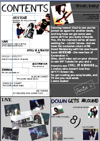 This is final design for my contents page; it doesn’t differ much from my mock up layout as I was pretty set on what I wanted from the start.
I didn’t want it to look like solid text, so I broke it up into sections using boxes making it easier for regular readers to find the sections they want. It will also be easy enough for new readers to hunt down features they want to browse at.
The white section is just the main features and its page numbers; I don’t want too many features cluttering the page. There are a few images, as I don’t want it to be overrun with images either.
The dark grey box is a regular occurrence in my magazine for the editorial. It gives the editor a chance to say a personal message to the regulars who keep the magazine going. The tone and language used in the editorial is similar to the tone and language used in the interview – chatty, informal and swearing – ‘Generation Y’. There is a quirky signature at the end to add an even more personal touch to the message.
The two grey boxes at the bottom are meant to be a regular feature on my contents page too – the right hand one is a feature I have called ‘Down Get’s Around’ where we showcase any crafty finds we have encountered on our daily travels – any celebrities that have been spotted, including any chats we’ve managed to get; just a fun little feature.
I believe that this feature implies that ‘Down’ has a good relationship with the celebrities they snap pictures of, as they don’t mind having a quick chat etc. This shows that ‘Down’ isn’t a typical, bitchy magazine and is fun and friendly.
The big ‘8)’ in the middle of box is a popular emoticon that connotes ‘sneaky peeking’ or things along those lines, our target audience will understand what it means.
The left hand side box is displaying some images from a popular gig I have named ‘L!VE’ that my magazine has exclusive information and pictures of.
Again, I have stuck to my basic colour scheme – just blacks, greys, whites and the odd hint of colour. I think it makes it more sophisticated, but then again not too posh. It also works well with my ‘Generation Y’ theme.
Double Page Spread Analysis

This is my final design for my Double Page Spread for my magazine ‘Down’. The first thing you probably notice is that there are a lot of images – this is exactly what I wanted. Initially because personally, I prefer to read something that has quite a few images to go along side it – I think it makes it look more attractive and entices me to read it more. Also, I took a lot of pictures that I really liked and wanted to feature them somewhere in my magazine.
I put the name of the band ‘Above Board’ right at the top in the middle to attract the reader’s attention – fans of the band will be drawn directly to this page, also they will recognise the pictures of their idols.
I chose the name ‘Above Board’ for my band as my interview is about the front man who has just made it through a really tough time and come above his emotional issues – he has come above it – above board.
There are also two quotes featured on the double page spread as another method of trying to attract the attention of the readers. The main, big quote states “People look at me and think ‘Sex, Drugs & Rock ‘n’ Roll’ and that’s exactly what I want them to see.” – This backs up my ‘Generation Y’ approach completely. The front man himself is even admitting that this is the image he wants to portray, and so do I – the magazine – hence why I have emphasised this quote. The fact that this quote is featured beneath one of the larger images also draws attention to it well.
Just above the large image that the main quote is staged, there is a smaller quote in the middle of other smaller images. This quote is commenting on how David – the front man – “hasn’t banged them yet” referring to the female members of his band. This is promoting the sex side of ‘S, D & R’n’R’ implying he is quite the womaniser and very much into sleeping around.
I have chosen all this images, not only because I think they look good and have strong, warm colours – but because they help portray many messages I want to put across in this particular interview.
The image I was originally going to use as a front cover image is now one of the larger images on this double page spread, and it features both girls – Zofia and Victoria – kissing David’s cheeks whilst he is blowing smoke out of his mouth. This is boosting the ‘Sex’ side of things – he is an appealing man and the rebellion only adds to his sex appeal. They don’t care that he is a bit of a bad man, why should anyone else?
Also, in many of these pictures you can see the band members laughing and smiling together, connoting that they have a fun side and don’t take things too seriously, which backs up the jokey sex quote near the images. They also seem loving towards one another in the pictures, which portrays the strong bond they have between them, which is backed up in the interview itself.
There is also an advert featured near the bottom of the page near the smaller images, promoting the band’s new album ‘Generation Reborn’ – this is done in the same font as the band’s name, therefore promoting them further. I called their new album ‘Generation Reborn’ as it includes the word Generation – ‘Generation Y’ – and the word reborn backs up their story of how the front man has come out of the dark hole of his life, and his spirit is being reborn so to speak. This is all backed up in the interview.
The interview itself is talking about the front man’s spiralling depression and how his new found band members have brought him out of his dark hole and shone happiness into his life again. So, there is a serious side and a casual, funny side to my interview.
I put boarders around some of my images, because sometimes the photo itself finished either halfway through their hair, or their clothing etc, and it looked odd with a white background, so I gave them a black boarder to cover this.
I didn’t want my double page spread to look too heavy with text, but I didn’t want it to be too wishy-washy, and something pathetic no one would bother reading. I changed the layout slightly from my original plan, because I couldn’t have anything overlapping the middle as this caused problems in printing. I also prefer this layout.
Again, like the front cover I wanted to stick to minimal colours because I didn’t want it to look too busy.
Final Front Cover Analysis
 This is my final design for the front cover of my magazine. This was not my original choice for a front cover image, but the original photo I wanted to use was landscape and was difficult to place on the front cover with the kind of layout I wanted. I have written about this in more detail in a previous blog.
The first thing I want to talk about with this design is the name/title, ‘Down’. The name came around when I was listening to music, and a song called ‘Down’ came on, I was originally just using it as a temporary name – but it then came to me that this fit my magazine quite well. David, my front man for my magazine has had a rough past, feeling down and this is all about his comeback, so I thought it was quite a good name for this particular magazine.
Another thing I liked about the title was how well it fit with the image. At first I thought the photo would create problems as a front cover image because the title wouldn’t fit well at the top, but then I thought – to be different and to make it fit better – I would put the title going down the side. This way it goes against the conventions slightly, which is what I want, and I have the title ‘Down’ actually going down, which I thought worked well.
The font I used for the title and for the main theme of my magazine is called ‘All Over Again’ which we got downloaded from www.dafont.com and put onto the school system. I originally only had the normal font going down the side, but it didn’t stand out above the ‘Above Board’ strapline, so I edited the font in Photoshop to make it stand out more – giving it a blue/grey shadow. I was a bit worried initially about editing the font, because I didn’t want too many colours on my front cover – I wanted to stick to about 3, if that – but as I only used a grey/blue colour for the shadow, it made it stand out without making it look out of place, which I liked.
I decided to put the issue number and price beneath the title, rather than near the barcode to help the title stand out further.
I didn’t want too much on my front cover, as this is a ‘special issue’ so to speak that is mainly focused around David and his band ‘Above Board’ who are making a come back. I was inspired to do this by other Music Magazines such as ‘Q’ who recently did a special on John Lennon, and ‘Kerrang!’ who also recently have done a special on ‘My Chemical Romance’. The covers of the magazines were basically dominated by the special features, and this is what I wanted mine to be like.
So, because of this I decided that I would have one large photo being the main image as well as the background, so it completely dominates my cover. I didn’t want any other features to ruin the image, so I only had a strapline of the band’s name and a quote from their interview. There’s always the issue though that my magazine wouldn’t sell well if it only showcased one feature, so I decided to do packaging which I have previously blogged about.
I wanted the title of the band ‘Above Board’ to stand out to grab fans attention, but I couldn’t have it drown out the attention of the title of the magazine. I downloaded the font ‘PEIXE FRITO’ again from www.dafont.com to use as the band’s logo/signature font, which is featured again on the double page spread. I then just used the simple ‘Arial’ font for the quote as I didn’t want it to look ‘too much’.
Getting onto the image itself, I took ‘the rule of thirds’ into consideration – our audience is typically drawn straight to the middle third/section. My image fits this really well, as bang in the middle section you have David’s bright red lips. Red is a good colour for attracting attention – it connotes ‘stop and look at me’. Also, red can connote ‘danger’ which fits well with the theme of my magazine ‘Generation Y’ – David is a dangerous come back kid, who is backing up the stereotype ‘Sex, Drugs & Rock ‘n’ Roll’. He is a rebel and slightly ‘off the rails’, which will appeal to my target audience. My magazine is backing up the stereotype of ‘Generation Y’. Another thing red can connote is 'sex and passion' which relates to Generation Y's main motto 'Sex, Drugs & Rock 'n' Roll'.
I wanted David to look rugged and rogue, to fit my ‘Generation Y’ criteria. David was a good model for this, as he has the messy hair and rough stubble – he isn’t a primp and preened pretty boy, which is good for my type of magazine. When it came to his make-up, I wanted a slight ‘Corpse Paint’ inspired look, but not too heavy as my magazine isn’t a metal magazine, so I didn’t want it to look too pretentious. Also, this whole rebellious look helps the connotations of ‘danger’ and ‘Sex, Drugs & Rock ‘n’ Roll’.
Because of this, I only did one eye ‘Corpse Paint’ inspired, and didn’t overdo it too much. The other eye I just did mascara marks, and messy marks to attempt to make him look more ‘roughed up’ so to speak. It was all a bit experimental really, the red lips were just mainly to attract attention and to make him look more controversial and not like every other male artist out there.
The reason why I had David pose topless for this picture was because I wanted to add to the ‘Sex Appeal’ to fit the ‘Sex’ part of the ‘S, D & R’n’R’ criteria – even though my magazine is a male based magazine, and my target audience features more around males – I wanted there to be some sort of appeal for female readers. Also, David has a hairy chest, which adds to the ‘rugged’ look (manly) and I had kiss marks put all over his chest to add to the ‘womanising’ sex appeal.
The cigarette in this image is evidentially not accidental – I wanted David to be seen smoking and blowing smoke from his mouth on my front cover. It adds majorly to my ‘Generation Y’ criteria – he is rebellious and a ‘bad man’ – he’s not afraid to be seen smoking and doing other ‘bad man’ things, i.e. drugs, which is mentioned in the interview. It connotes that he is into drugs and doesn’t have a problem with breaking the rules, or being caught breaking the rules.
When Rock ‘n’ Roll is mentioned, the image springs to mind of care free rockers jamming, smoking, drinking and having a raunchy, fun time. I want this image to be portrayed throughout my magazine, and my front cover image helps support this to some extent.
Also, the cigarette is in the middle third/section so you are drawn to it, so immediately the reader can tell this is a magazine about rebellion, and ‘true rockers’. He hand is right in the fore-front as well, which draws you to it. This will attract my ideal audience well.
I want my magazine to say, "Generation Y all the way!"
Mock Up Contents Page
 Here is the mock up for my contents page. I am challenging the conventions with my contents page, as I don't want mine to be too similar to every other magazine out there. My contents page will only include the main features of the magazine, and have boxes at the bottom showcasing some of these features along with images.
I also want there to be an editorial at the right hand side, with a picture of the editor, along with the date and issue number. I also want to include a signature style sign off by the editor as to me that seems more personal to the reader.
The bottom box on the right hand side I want to portray a feature I'm going to call 'Down Get's Around' - here there will be pictures of celebrities the workers at 'Down' have spotted on their daily travels, and maybe even spoken to. Unofficial meetings, so to speak.
Subscribe to:
Posts (Atom)